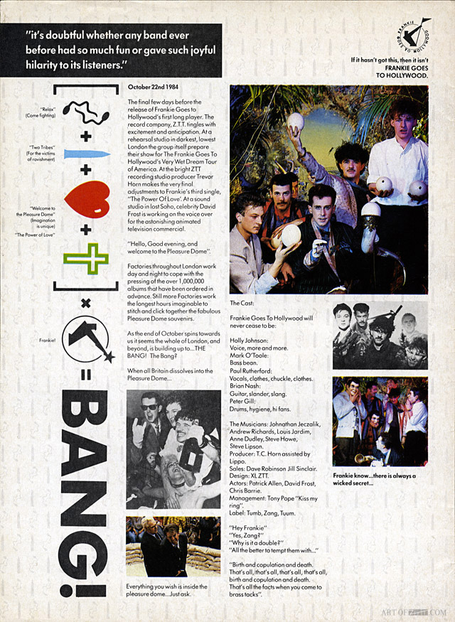
There are lots of props, masks, horns, animals, even a small child, was this all your idea or the brief?
Peter Ashworth: “Paul wanted lots of elements, I found all sorts of things in the props houses of west London, which I knew well …. I chose a load of things and added them to the set until it felt right”.
Who was the child and what was he/she meant to represent? a Pan-like figure maybe?
Peter Ashworth: “No idea where the child came from, but he was meant to represent naivety”.
Did the band get into it or where they apprehensive? Holly seems to be revelling in the decadence but the rest seem unsure.
Peter Ashworth: “When the band arrived it was obvious that they knew nothing about the jungle theme and were initially shocked, but got into the groove”.
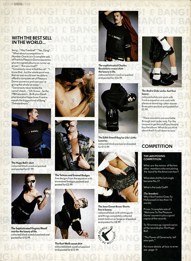
artist: Frankie Goes To Hollywood title: Welcome To The Pleasuredome format: 5 pg No.1 advertorial design: XLZTT illustration: Lo Cole photography: Anton Corbijn / Peter Ashworth / AJ Barratt / Eric Watson / Peter Brown / Steve Rumney cat. no: ZTT IQ 1 date: 03/11/84 art of notes: This 5 page advertorial for the album appeared in No.1 magazine along with the group on the front cover and a sixth page with the album reviewed by Nick Rhodes from Duran Duran as well as a No.1 staff writer.
The cover image isn’t actually by Lo Cole and remains uncredited aside from the word ‘Crusade’ which could be the image title. It’s possible that it was done by Hierographics, the company responsible for animating Lo’s cover images for a 40 second TV advert at the time. Amazingly there was also a further 1 page advert for the album elsewhere in the issue too – this point was quite possibly the apex of Frankie’s fame.


